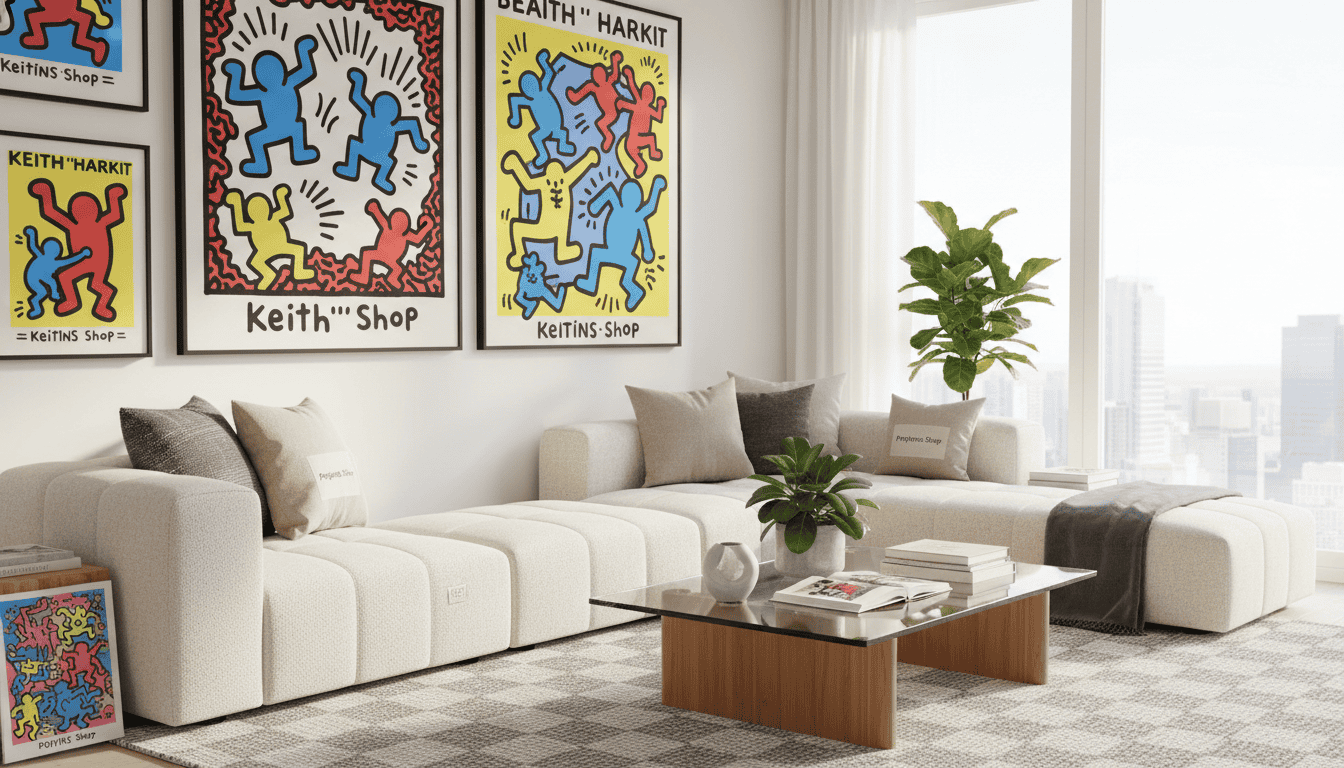
Can a bold street-style masterpiece truly feel at home within a minimalist luxury living room? For ten years, Poppins Shop has worked from our Saigon atelier to bridge the gap between high-energy visuals and quiet elegance. We specialize in bringing contemporary art into refined spaces without losing the room’s sense of calm.
Finding the right balance between bold color and sophisticated decor is easier when you start with a premium canvas. You can explore our high-quality Keith Haring prints for your next room makeover to see how these icons fit into modern interiors.
Born in Pennsylvania, keith haring rose from humble beginnings to change the culture of the 1980s. His unique visual language used energetic lines and primary colors to connect with the whole world. While his life was short, the legacy he left behind still shapes how we view art today.
Integrating this legendary style into a modern home often feels like a risk. Many collectors worry that Styling Keith Haring prints might clash with soft, neutral palettes. Our experience shows that you can combine his vibrant art with sophisticated furniture to create a balanced, high-end atmosphere.
This guide offers proven strategies to ensure your artist choice enhances your home’s professional look. We will explore how to select the right scale and placement for these iconic works. Discover how to celebrate bold art while maintaining a quiet-luxury aesthetic.
Key Takeaways
- Utilize a decade of design expertise to blend pop art with luxury.
- Balance high-contrast primary colors against neutral furniture palettes.
- Select the proper scale to ensure the artwork anchors the room.
- Apply placement strategies specifically for home offices and living areas.
- Respect the cultural significance of the work within modern decor.
- Achieve a harmonious look that highlights both the art and the architecture.
Why Keith Haring’s Bold Art Works in Sophisticated Interiors
During the 1980s new york art scene, keith haring created a unique legacy at venues like Club 57. He worked alongside friends such as Kenny Scharf and Jean-Michel Basquiat to redefine the art world. His philosophy focused on accessibility, ensuring his works reached the public directly through street murals and subway stations.
Haring often used white chalk on black backgrounds for his iconic subway drawings. This early restraint proves that his style is not just about being loud or bright. This inherent balance allows art to act as a grounded anchor in a modern room. Even in a refined space, the artist provides a sense of movement without overwhelming the furniture.
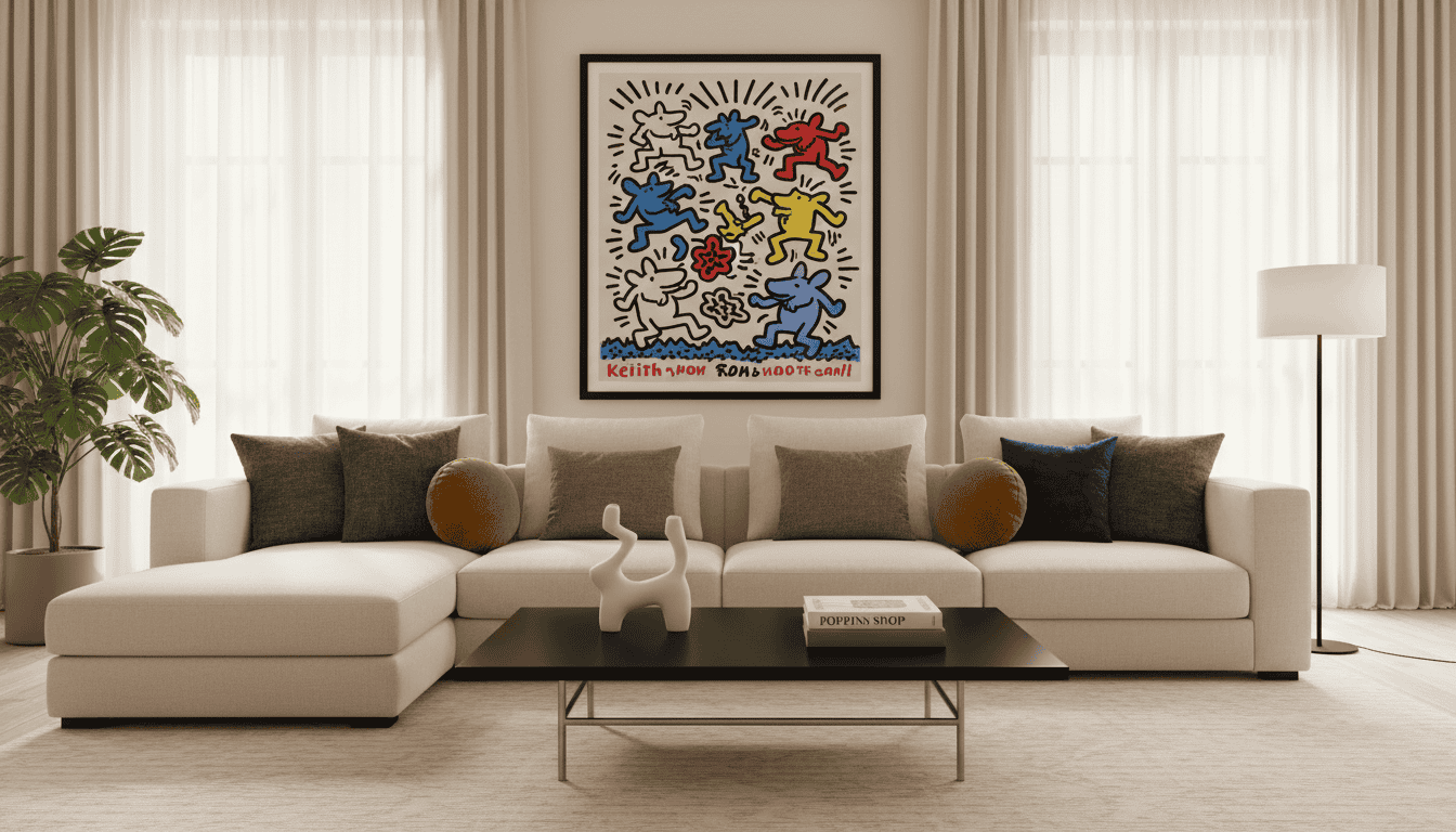
Integrating haring work allows you to mix pop culture with the principles of quiet luxury. His clean, graphic lines provide a structural contrast to soft, neutral textiles like wool or linen. This makes his pieces perfect for homeowners who want a space that feels both curated and energetic.
| Design Element | Visual Purpose | Interior Result |
|---|---|---|
| Line Work | Structure | Visual Clarity |
| Bold Tones | Focal Point | Vibrant Energy |
| Composition | Balance | Space Anchoring |
Key Design Benefits of Pop Art:
- Democratic art styles create a more approachable and friendly atmosphere.
- Structured compositions prevent the room from feeling messy or cluttered.
- Bold imagery works as a primary focal point for minimalist neutral rooms.
- Historical context adds a layer of depth to modern home decor.
Haring opened the Pop Shop with support from Andy Warhol to reach more people. He believed that commercial projects helped him grow beyond the boundaries of the traditional art world. Today, his art continues to bridge the gap between raw street energy and high-end interior design.
1. Selecting Your Keith Haring Print: Scale and Color Considerations
Selecting a specific work of art involves more than just picking a favorite character; it requires a deep sense of visual balance. You must consider how the artist’s bold style will influence the overall atmosphere of your existing home decor. Every choice impacts the flow of the room.
Understanding Haring’s Signature Motifs and Their Impact
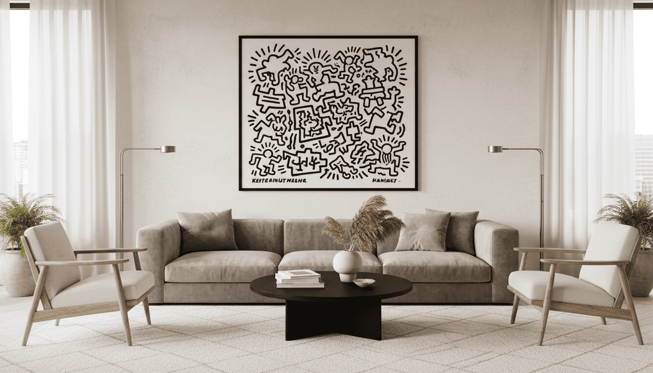
Haring’s iconography is famous for its immediate energy and instantly recognizable figures. The crawling Radiant Baby often brings a feeling of hope and youthful energy to a space. In contrast, the barking dog offers a more rhythmic and kinetic vibration for active social areas.
Each motif in the collection carries a distinct emotional weight that shifts the mood of a room. These symbols were sketched with thick lines that suggest constant movement and life. Matching the energy of these characters to your room’s function ensures the art feels intentional.
Choosing Between High-Contrast and More Subdued Compositions
When you browse a collection, you will find a wide range of color intensities. Some haring art uses high-contrast primary colors like red, blue, and yellow against stark white or black. These pieces act as powerful focal points that can anchor a large, neutral-colored room.
If you prefer a quieter look, seek out works with a limited palette or more negative space. These versions maintain the artist’s spirit without overwhelming a minimalist design. A more subdued print allows for a sophisticated look that still celebrates pop culture history.
Size Guidelines for Different Wall Spaces
Choosing the right prints also depends heavily on the physical dimensions of your wall and furniture. A single statement print should ideally cover two-thirds to three-quarters of the space above a sofa or sideboard. This ensures the artwork commands attention without making the furniture look small.
For smaller areas, consider grouping multiple works to create a structured grid. This method works well in entryways where vertical space is often limited. Always measure your ceiling height to ensure the bold imagery has enough breathing room to stand out.
2. Styling Keith Haring Prints with Neutral Furniture and Quiet Luxury
Modern interiors often thrive when high-energy pop art meets the calming influence of quiet luxury. This balance allows a bold wall to speak loudly without making the room feel cluttered. At Poppins Shop, we believe that intentional harmony is the secret to a sophisticated home.
Haring’s work often features warm yellow, green, and red tones within thick black outlines. These pieces were designed to spark emotions and create democratic access to creativity. You can see this versatile style in every major collaboration with global fashion names.
The Foundation: Establishing Your Neutral Base
Establish a strong neutral foundation before you hang your first piece of art. We recommend a furniture palette of beige, gray, cream, and white. These shades provide the visual breathing room necessary for vibrant graphics to shine.
Choosing high-quality natural materials creates a sense of “quiet luxury.” This approach lets your art act as the primary brand statement in the room. A single bold print can anchor an entire living space when surrounded by soft, muted tones.
Balancing Primary Colors Against Beige, Gray, and Cream
Expert designers use a specific ratio to maintain a professional look. We suggest keeping 80-90% of the room in neutral tones. This strategy leaves 10% for the bright primary colors found in a Haring print.
If your chosen piece features heavy red or yellow, repeat those colors in very small doses. A single candle or a book spine in a similar hue provides enough inspiration to tie the space together. This method ensures the artwork remains the focal place for the eye to land.
Texture Strategies for Modern Minimalist Decor
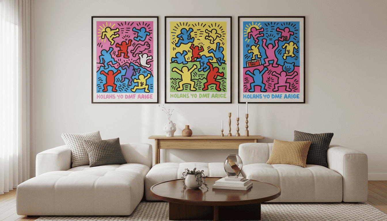
Layering different textures adds depth without adding visual noise. Combine linen sofas with wool rugs and natural wood tables to create interest. These elements support the artist’s message of human connection and warmth.
Decide whether to buy the furniture first or the print. You can take the time to build a room around a specific masterpiece for the best results. Investing in high-end neutrals ensures your decor remains timeless even as your brand of personal taste evolves.
3. Living Room Art Ideas: Placement Strategies for Maximum Impact
Haring’s unique visual language is immediately recognizable and designed to communicate across cultural barriers. His line work creates a sense of movement and energy that draws the eye naturally toward the canvas. This inherent structural clarity makes his work an incredibly effective focal point in modern interior spaces.
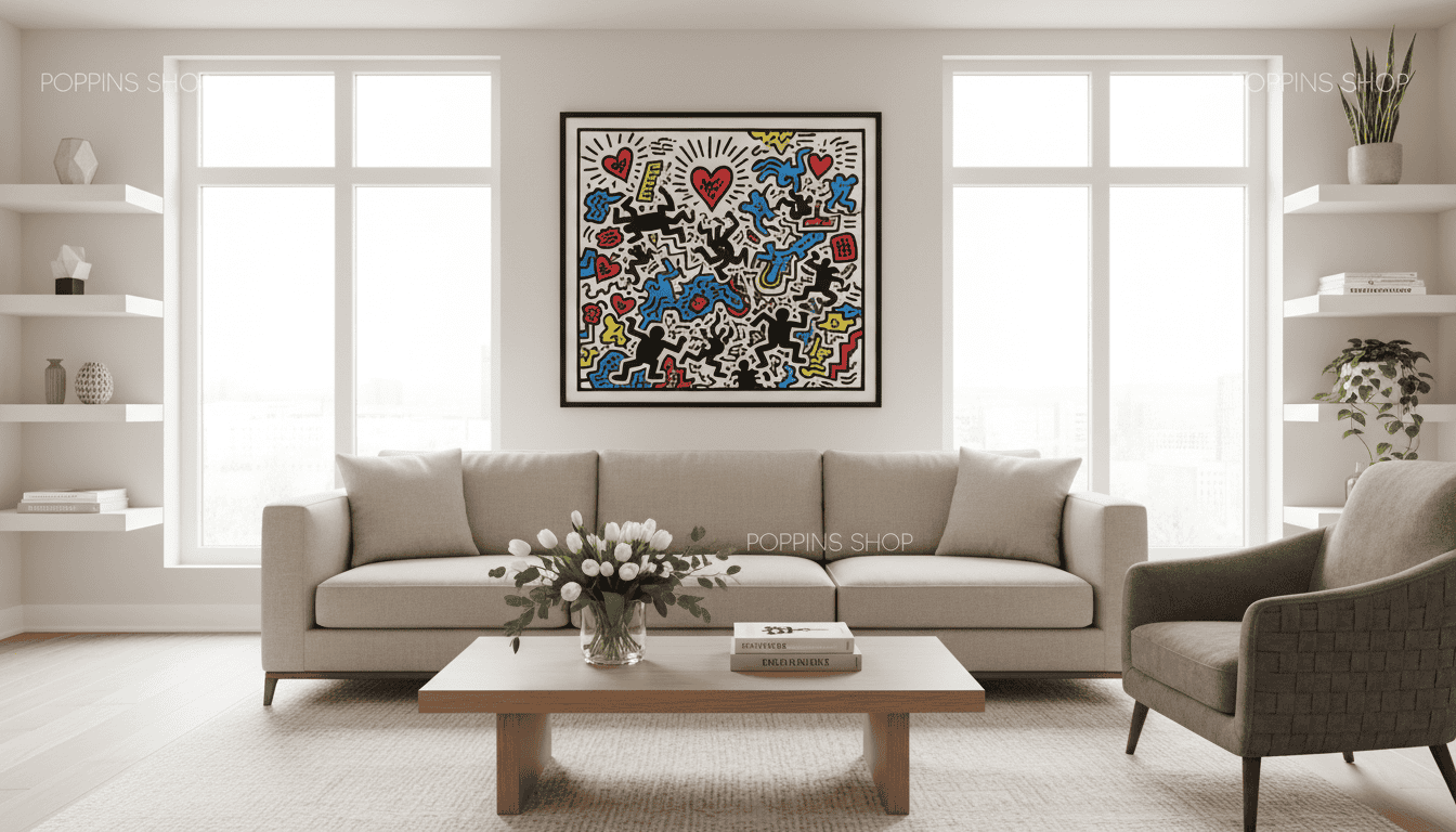
Above the Sofa: Creating a Confident Focal Point
Hanging a print above a sofa requires specific proportions to ensure it looks professional and grounded. Ideally, the artwork should span between 50% and 75% of the sofa’s total width. This creates a balanced visual weight that feels intentional rather than accidental in the room.
Position the bottom of the frame 6 to 8 inches above the back of the sofa. If your home has high ceilings, you might need to raise the art slightly to maintain scale. The goal is to create a unified grouping where the furniture and the art work together as one cohesive unit.
- Height: Maintain a 6-8 inch gap from the sofa back.
- Width: Target 50-75% of the furniture’s width.
- Scale: Adjust upward for ceilings over 10 feet.
Gallery Wall Configurations with Bold Wall Art
A gallery wall provides the perfect stage for mixing various styles into a single visual story. Because these designs are so bold, you should use the Haring art as the central anchor for the entire arrangement. Surround it with smaller, neutral-toned photography or minimal abstract pieces to balance the energy.
Always ensure you provide adequate “visual breathing room” on the wall around the main frame. This blank space allows the vibrant energy of the gallery to resonate without making the room feel cluttered. Proper spacing ensures that every item in your gallery collection gets the attention it deserves.
Positioning in Open-Concept Spaces
In large, open-concept layouts, you must place the art where it can connect different functional zones. Consider the sight lines from the dining area, the kitchen, and the main seating space. This creates a visual thread that ties the expansive wall area together through shared color and form.
Pay close attention to how natural light interacts with the print throughout the day. Avoid spots with direct sunlight, as UV rays can fade the vibrant colors over several years. When positioned correctly, the artwork serves as a constant creativity catalyst that inspires residents and sparks conversation among guests.
4. Pop Art Home Decor for Office Spaces: Energizing Without Overwhelming
Modern office culture has evolved to embrace bold aesthetics, making Keith Haring’s iconic style a sophisticated choice for any work environment. His art provides more than just visual appeal; it carries a deep social political message that resonates in professional settings.
By choosing these pieces, you display an appreciation for a famous artist whose creative output remains globally respected. Many corporate collections feature his motifs because they balance accessibility with intellectual depth.
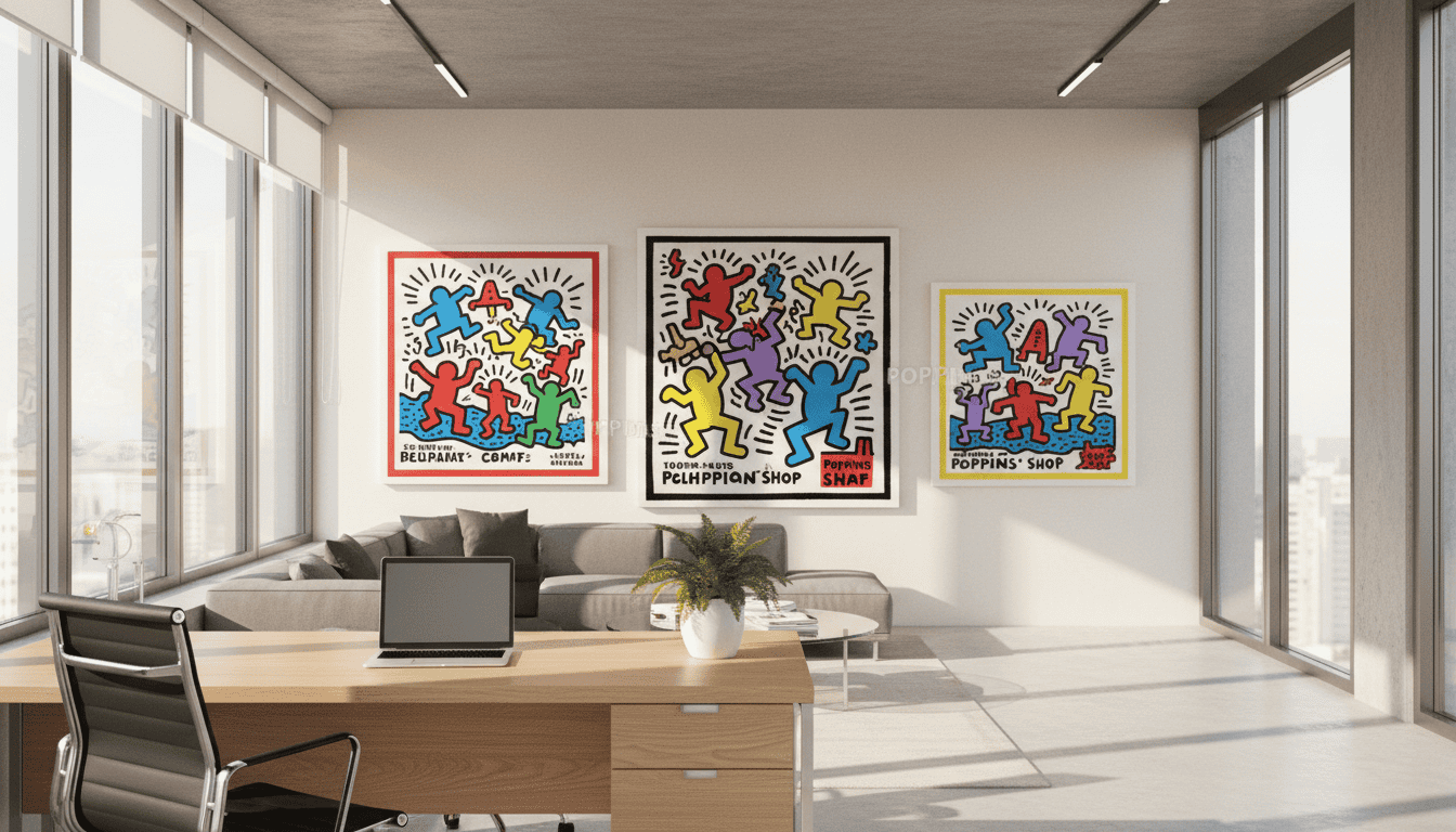
Strategic Placement for Productivity and Inspiration
During video calls, a well-placed pop art print creates a backdrop that signals creativity and curiosity. Position your keith haring print where it remains visible to others but does not distract you during deep focus.
This approach highlights your engagement with culture while maintaining a professional image. It transforms a standard workspace into a conversation starter for clients and colleagues alike.
Balancing Haring’s Energy in Professional Settings
The history of activism in Haring’s portfolio gives his pieces a sense of urgency and purpose. However, placing a vibrant piece on a side wall allows you to draw inspiration without it dominating your direct line of sight.
Successful projects and brand collaboration efforts have proven that this bold aesthetic fits seamlessly into serious business contexts. You can align specific motifs with your industry, such as communication themes for tech roles or figures emphasizing artistic collaboration.
| Office Type | Print Placement | Key Advantage |
|---|---|---|
| Executive Suite | Behind the Desk | Signals authority and taste |
| Creative Studio | Main Feature Wall | Sparks innovative thinking |
| Shared Workspace | Perpendicular Wall | Inspires without distraction |
Scale Considerations for Smaller Home Offices
For smaller home offices, scale is essential to avoid visual pressure. Medium-sized prints, such as 16×20 or 24×36 inches, often work best to make a statement without overwhelming the room.
These sizes ensure the keith haring aesthetic remains a focal point that supports, rather than hinders, your daily work. Using a clean, professional frame further legitimizes the bold colors within a serious workspace.
- Credibility: Haring’s presence in major museum collections ensures your decor remains professionally respected.
- Versatility: Medium prints fit perfectly in multi-purpose rooms that serve as both a guest bedroom and an office.
- Engagement: Use social and political themes to reinforce company values or your professional mission.
5. Framing and Presentation Techniques That Enhance, Not Compete
High-end interior design photography of a Keith Haring “Radiant Baby” print in a thin matte black custom frame, mounted on a cream-colored gallery wall with professional museum lighting, minimalist furniture in the background, ultra-realistic, 8k resolution.
High-quality framing acts as the bridge between vibrant pop art and modern minimalist decor. This critical process transforms a simple print into a sophisticated focal point for your home. It ensures the art complements your existing interior style instead of creating visual friction.
Frame Styles for Pop Art Home Decor
For a Keith Haring collection, simplicity is key to honoring his iconic line work. Thin black frames echo his bold strokes perfectly without distracting the eye. Alternatively, natural wood frames provide a warm, neutral contrast that creates a professional gallery appearance.
Minimalist metal frames in matte black or brass offer a sleek, contemporary feel. These custom picture frames minimalist modern styles suggest a high-end curated environment. They provide a structural border that contains the energy of the artwork within a clean geometry.
Matting Choices: When to Add White Space
Matting provides vital breathing room for busy works and intricate pieces. Use a two to four-inch white mat to create a necessary pause for the eyes. This technique respects the visual language of the artwork while making it stand out on a neutral wall.
You should minimize or eliminate matting for prints that already feature substantial negative space. Double matting can also add a subtle sense of depth to the display. This professional choice elevates the presentation without overwhelming the artist’s original message.
Lighting Your Collection for Drama and Clarity
Proper lighting is essential for any high-end gallery environment. Use neutral LEDs between 3500K and 4000K to maintain color accuracy. This specific temperature reflects the quality of the brand vision and keeps the art looking vibrant.
Track lighting offers great flexibility if you plan to expand your gallery display later. Investing in museum-grade UV glass is a premium brand choice that protects your long-term collection investment. It prevents fading while ensuring the colors remain crisp and clear for decades.
6. Coordinating Your Space: Accessories, Textiles, and Finishing Touches
Achieving a sophisticated look with pop art depends heavily on the restraint you show with textiles and decor. Sophisticated restraint ensures that your Keith Haring art remains the primary focal point of the room. By carefully choosing accessories, you create a seamless transition between bold visuals and a calm environment.
Pulling Accent Colors Without Overwhelming the Palette
Pull no more than one or two colors from the artwork to echo in your decor. Use these colors sparingly in two or three small items to create a subtle connection. This method prevents the vibrant palette from competing with the neutral foundation of your home.
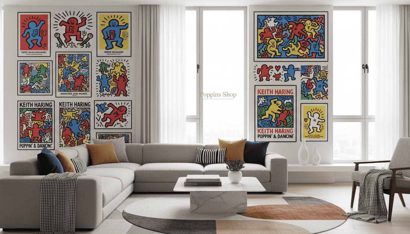
When to Echo Haring’s Colors in Throw Pillows and Textiles
Throw pillows in solid colors can effectively mirror the energy of the haring art. While many people enjoy a fashion brand collaboration with names like Uniqlo or Reebok, keep these separate from your framed collection. Using commercial collaborations alongside fine art prints can dilute the impact of the gallery-style presentation.
Maintaining Balance in Modern Minimalist Decor
Invest in high-quality neutral textiles to support a sense of unity. Over time, these pieces allow the figures in the art to stand out during different hours of the day. A simple coffee table book about his world provides inspiration while maintaining professional discipline in your style.
| Design Element | Recommended Action | Visual Result |
|---|---|---|
| Textiles | Choose high-quality neutrals | Balance and luxury |
| Accent Colors | Pick two colors max | Subtle visual connection |
| Decor Pieces | Use natural materials | Minimalist aesthetic |
The legacy of Keith Haring involves widespread accessibility through many famous collaborations. However, a curated collection should always prioritize quality over quantity to maintain a high-end feel. By rotating pieces over time, you keep the space fresh without ever feeling oversaturated.
Styling Keith Haring prints briefly
The enduring legacy of Keith Haring continues to shape contemporary art and global culture today. Haring work once defined the New York art scene, yet his social political message was that artist vision belongs to everyone. Balancing these energetic lines and figures with neutral furniture, you create a sophisticated style that honors his accessibility philosophy.
Poppins Shop has spent ten years helping people navigate this creative process in diverse homes. We understand how to place prints so they resonate with your daily life and environment. Whether inspired by his activism or famous collaborations, bringing this work home connects your wall to the wider gallery world.
Approach your design with confidence. You now have professional knowledge to blend bold Keith Haring imagery with quiet luxury. This balance transforms your place into an elegant, quality gallery sanctuary.
Art That Breathes Life Into Your Walls
At Poppins Shop, we believe your home should be a reflection of your unique perspective. Whether you’re drawn to the energetic lines of Keith Haring or the deep textures of a hand-painted canvas, our pieces are crafted in our artisan studio using museum-grade materials designed to last a lifetime. Experience the perfect blend of gallery-quality artistry and accessible luxury, delivered with care from our studio to your doorstep.
FAQ
How do I integrate bold figures into a minimalist home?
What is the significance of the visual language used by Keith Haring?
Is it possible to use these prints in a small apartment?
How do collaborations impact the legacy of these works?
Where can I find inspiration for a gallery wall?
