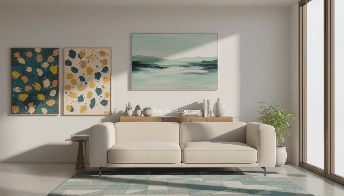
I remember the first time a single piece changed an entire room. It felt like a secret code had unlocked a calmer, more confident home. That moment showed me how a single selection can guide every paint choice, fabric, and finish.
Treat the artwork as your starting point. Choose a leading piece, then let its tones set the 60-30-10 rule: 60% dominant hue, 30% secondary, 10% accent. This method brings balance and a refined, intentional look to any residential space.
Poppins shop approach blends professional consultancy with personal narrative. We help you consider light, shadow, and material so every decision supports cohesion. The result is a curated refuge that feels both stylish and truly yours.
Key Takeaways
- Treat your chosen piece as the palette’s foundation to create cohesion.
- Apply the 60-30-10 rule for balanced color distribution.
- Consider how light shifts color and depth throughout the day.
- Match textiles and finishes to reinforce the primary tones.
- Design choices should reflect your personal story while staying deliberate.
The Philosophy of Art as a Design Anchor
A single framed piece can act as the compass that guides every design choice in a room. Start with that focal selection, and choices for color, scale, and light gain immediate clarity.
Choosing from curated options means you buy more than an object — you adopt a design philosophy. Good selections prioritize emotional resonance and balanced composition.
Design professionals often recommend beginning with a bold choice that defines mood and color temperature. That early anchor narrows down secondary options and speeds decision-making.
“Let the focal selection lead; the rest of the space becomes intentional rather than accidental.”
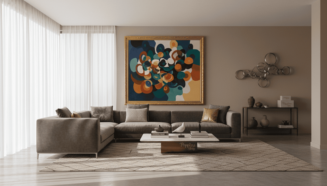
Intentional placement transforms a simple room into a gallery-like experience that reflects your taste and commitment to quality. The right approach turns visual potential into a cohesive, lived interior.
Understanding Wall art and decor for Your Home
Start by listening to what your tastes consistently return to—tones, subjects, and moods that feel like home. This first step makes choices faster and more confident.
Defining Your Style
Define a clear style before you buy. Look at portfolios from creators like Cassia Beck to see how theme and technique shape a collection.
Our selection offers varied styles so each homeowner finds the right prints and pieces. Monika Strigel’s registered collection shows how a cohesive range can set a room’s personality.

The Impact of Color
Color changes how a space feels. Hillary Murphy’s nature-inspired works from Portland prove vivid palettes can lift a room’s mood.
When you browse the page, consider options that echo your textiles and finishes. A thoughtful collection ties every selection together for a professional, lived-in result.
“Curate pieces that speak to your daily life; the right collection becomes a living portrait of you.”
The 60-30-10 Rule Explained
Start with a simple rule that turns color choices from guesswork into strategy.
The 60-30-10 rule is a classic design principle. It assigns 60% of the space to a dominant hue, 30% to a secondary shade, and 10% to an accent. This ratio creates balance and clarity in any room.
When you use art as the starting point, the dominant tones in the piece often become the 60% base for walls and large furniture. Mid-tones from the same work supply the secondary 30%, tying textiles and finishes to the focal piece.
The final 10% is your chance to introduce a lively accent. Pull a small, vibrant color from the painting to energize shelves, cushions, or a lamp. That pop makes the palette feel intentional rather than accidental.
“Apply a simple mathematical approach and the space will read as balanced, professional, and complete.”
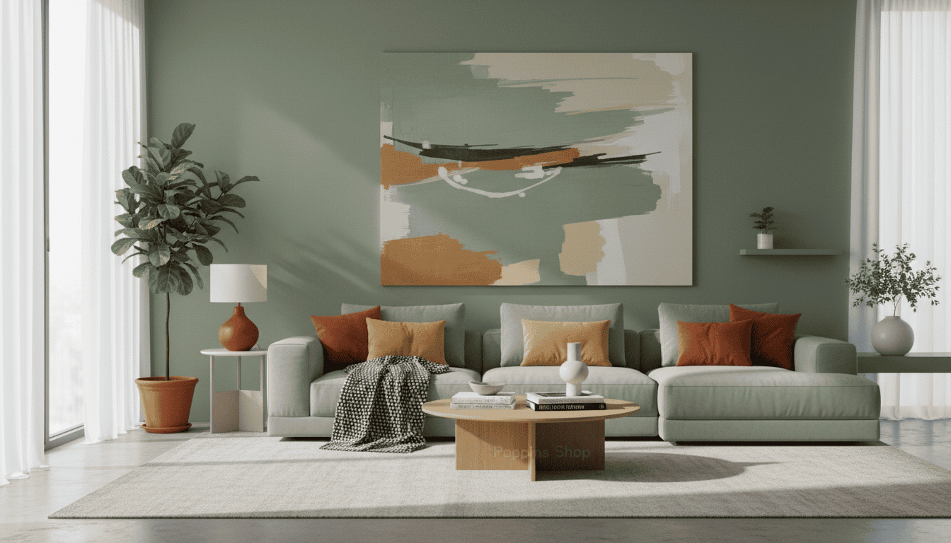
Selecting Artistic prints for Cohesive Spaces
Choosing prints that echo your textiles makes a room feel intentionally composed. Start by holding a sample fabric near a print to test undertones before committing.
Matching Tones to Textiles
Selecting high-quality Artistic prints requires an eye for detail. Ensure tones in each piece harmonize with your furniture and soft textiles.
Consider texture as well. The finish of a print can contrast or complement curtains, rugs, and throw pillows. This interaction changes how color reads in the room.
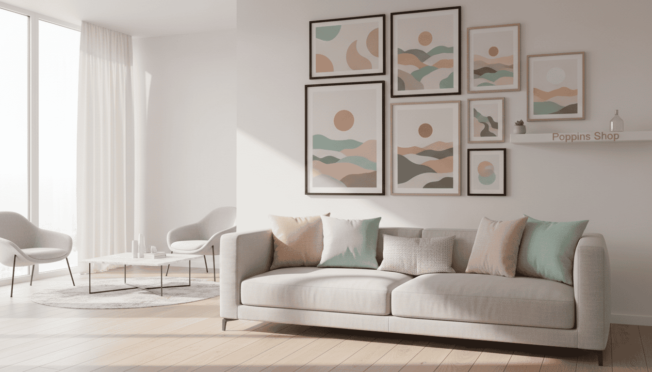
Our selection process guides you through balanced options that bridge fine expression and practical use. We present curated choices that work with neutral foundations or bolder palettes.
“Matching subtle undertones in prints to textiles creates a polished, curated look.”
Explore different Artistic prints to see how they shift mood. Small changes in tone or texture can transform a space and give you room to evolve the overall aesthetic.
Why Hand-Painted Canvas Defines a Room
Nothing compares to the living energy a handcrafted canvas brings into a space. At Poppins shop, our Saigon atelier has spent ten years refining 100% hand-painted oil-on-canvas work for discerning clients.
Each canvas creates texture and depth that mass-produced prints cannot match. The layered oils catch light differently through the day, giving the piece shifting moods and renewing a room’s feel.
Our artists commit to every brushstroke. They shape color, relief, and finish so each work becomes a unique conversation starter and a central focus for your design.
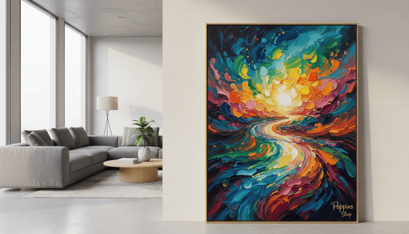
Choosing hand-painted wall art ensures you add a one-of-a-kind element to your home. The tactile surface and rich pigments bring a sophisticated finish that elevates daily life and the overall atmosphere.
“A genuine oil-on-canvas piece does more than fill space — it defines it.”
The Role of Texture in Interior Design
Texture transforms a flat plan into a layered living environment that invites touch and sight.
Texture plays a critical role in interior design. It adds visual interest and prevents a room from feeling one-dimensional.
Introducing hand-painted oil works brings tactile depth. The surface invites the eye to linger and discover details that change with light.
The contrast between smooth surfaces and richly textured pieces creates a dynamic, curated feel. That balance makes everyday living more comfortable and visually engaging.
Designers use texture to soften the clean lines of modern furniture. When layered well, materials add warmth without cluttering the view.
Understanding how to combine fabrics, finishes, and canvases is a mark of professional design. Thoughtful layering gives a home a rich, multi-dimensional quality that feels deliberate and lived-in.
“Texture is the silent architect of atmosphere; it turns surfaces into experiences.”
Evaluating Art & Prints for Your Color Palette
Begin by looking at the dominant hues in a piece to decide the room’s emotional tone.
Primary Hues
Identify the dominant color first. That hue will act as the foundation for large surfaces and major furniture. Use the dominant tone to set the 60% portion of your palette.
Secondary Accents
Study the subtler colors that repeat across the composition. These mid-tones supply the 30% layer and guide textile and accessory choices.
Neutral Foundations
Balance vivid tones with neutral fields to avoid visual overload. Assess light versus dark areas on the wall to ensure the room reads cohesive.
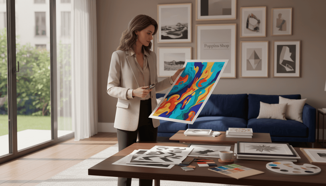
Practical tips: our page offers a clear guide for selecting the right piece, whether you need bold primaries or calming neutrals. We present options that match common color requirements. By analyzing secondary accents within wall art you tie textiles, finishes, and hardware together with intent.
“Evaluate tones by room light; small shifts change perception.”
The Craftsmanship Behind Our Atelier
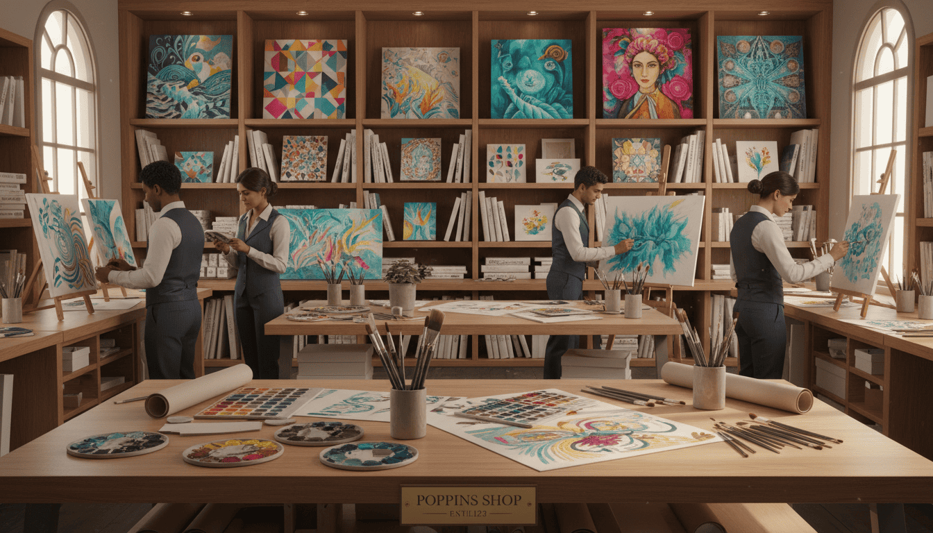
For a decade our Saigon atelier has refined techniques that honor time-tested painting traditions. We focus on hand-painted oil-on-canvas works made with careful, repeatable methods.
The craftsmanship behind our collection is rooted in traditional techniques. Each piece is designed for longevity and true expression of the artist’s vision.
We oversee every production step so each piece arrives ready to enhance your home. Our team of skilled artisans in Saigon brings decades of combined experience to every commission.
Choosing our studio means supporting a legacy that values the human touch in an increasingly automated market. Quality checks, signature finishes, and careful curing ensure every work performs for years.
“Craft is the bridge between idea and living space; we guard that bridge with practice and patience.”
Why We Choose French Pébéo Oils
Premium supplies are the silent promise behind each finished canvas that lives in a home.
We exclusively use French Pébéo oils on high-grade cotton canvas. These materials deliver unmatched color vibrancy and archival quality for collectors and daily living spaces.
Every piece is hand-cured for four weeks to stabilize pigments and binders. This careful process reduces discoloration and ensures the work retains its intended tones for years of life.
Why this matters: French Pébéo oils resist yellowing and keep colors true. Paired with premium cotton canvas, they form one of the best options for long-term performance.
On this page we explain material choices and the practical options available for commissions. We show how each selection supports durability, finish, and the final presentation.
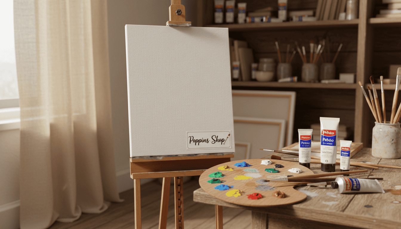
“By combining trusted oils with fine canvas, we ensure each piece meets professional standards and your expectations.”
The Importance of the Four Week Curing Process
A deliberate drying period is the quiet step that protects color and texture for years.
Every hand-painted work at our atelier undergoes a rigorous four-week curing process to ensure the oil paint fully stabilizes and bonds to the cotton canvas.
This period allows the oils to oxidize and harden properly. That chemical change reduces tackiness, prevents future cracking, and preserves pigment depth.
By following this strict schedule, we guarantee each piece arrives in pristine condition and is display-ready. We refuse to rush this step because patience is central to true craftsmanship.
Our commitment to a four-week curing cycle sets these hand-finished works apart. It ensures vibrancy and durability so the piece performs well in everyday settings and for generations to come.
“Quality is not hurried; it is grown with time and care.”
Integrating wall art wall art into Modern Interiors
In modern interiors, a well-chosen piece creates a counterpoint that warms clean geometry without clutter.
Start with scale and placement. Measure the furniture run first and choose a composition that sits comfortably above or beside it. A too-small piece will feel lost. A too-large one will overwhelm sightlines.
Use contrast to your advantage. Traditional hand-finished works add texture and human presence to minimal schemes. That contrast gives a modern room warmth and depth.
Our page offers practical placement advice so the selection becomes an anchor rather than an afterthought. Center height, negative space, and alignment with furniture all matter.
Keep sightlines clear. Let the piece breathe with a calm surround to make it the focal point that unites the room.
“A single thoughtful composition can turn a sterile modern space into a personalized, inviting sanctuary.”
How to Balance art in the wall with Existing Furniture
A well-scaled composition can make mismatched pieces read as a cohesive set. Start by measuring the width of your sofa, console, or bookcase. Let the composition span roughly two-thirds to three-quarters of that width so it feels anchored.
Consider height as carefully as breadth. Hang the center of the composition at eye level, about 57–60 inches from the floor, or align the base to sit just above the furniture’s top by 6–12 inches. This keeps visual weight balanced between surfaces.
Choose a selection from our page that complements the room’s tone and scale. We offer options that vary in size and finish so you can match a piece to sofas, sideboards, or grouped seating.
If placement feels tricky, our design consultants can suggest arrangements and spacing. A single, well-placed piece can unify diverse furniture and create a refined, intentional look for the entire room.
“A properly scaled piece organizes the room visually; it turns separate elements into a single, confident statement.”
Curating a Gallery Wall with Purpose
Purpose drives good composition; each selection should add meaning to the whole.
Begin by deciding what you want the display to say about your style. Choose pieces that share a mood or color thread so the arrangement reads as a single statement.
Mix sizes and styles to create rhythm. Include small prints beside larger works to guide the eye across the wall.
Our collection offers varied options to build a cohesive display that suits any room. Use the page to compare styles and pick a balanced selection.
Lay everything on the floor first. This low-risk dry run reveals spacing, scale, and the best sequence for each piece.
“A well-curated gallery turns a blank wall into the room’s centerpiece.”
Final tip: limit the palette and repeat a motif or hue to keep the grouping professional and personal.
Choosing the Right Canvas Size for Your Space
Measure twice before you pick a canvas size. Scale is the silent rule that makes a room feel intentional. A piece that’s too small will disappear on a broad wall; one that’s too large will dominate the space.
Start with the wall span above furniture and aim for two-thirds to three-quarters width. This simple proportion keeps sightlines balanced and creates a professional look without fuss.
Like Art.com’s range of over 200 custom-crafted frames and hand-stretched canvas prints, our canvas options let you match size to setting. Use our page guidance to compare sizes and avoid costly returns.
Measure the wall height and width, note furniture placement, then choose a canvas scale that reads as an anchor—not an interruption. Whether you prefer a single large canvas or a curated run of smaller prints, the right selection makes the room feel composed.
“Proper scale transforms a display from accidental to deliberate.”
Elevating Your Sanctuary with Original Works
A single authentic piece can recalibrate a space and make it feel unmistakably yours.
Original works bring luxury, personality, and depth that mass-made reproductions cannot match. They add texture, intention, and a living presence that shifts how a room reads.
Each selection on our page is designed to deliver unique energy. The right canvas will reflect your tastes and become a daily source of inspiration in your home.
By investing in originals, you choose beauty that rewards ordinary moments. A considered composition can transform a neutral scheme into a sanctuary that mirrors your life.
“Surround yourself with work that speaks to you; it will quietly change how you live every day.”
Wall art and decor in short
A considered finale pulls every decision into a single, calm expression.
Mastering the 60-30-10 rule with curated wall art will transform a room into a professionally designed sanctuary. Choose high-quality prints or hand-finished pieces to keep a room vibrant and personal.
The right selections unify furniture with textiles. This brings your home together and makes daily life more inspiring. Small, deliberate choices create big, lasting impact.
Explore the full collection to find the perfect wall art that starts your next design project. Start your journey toward a more beautiful living space today: Visit our shop.
Interior Design 101: Using Art to Balance Your Palette
Found your perfect color scheme? Let us help you complete it. Browse our collection of hand-painted artwork categorized by the most popular modern home palettes.
FAQ
How do I use a piece to balance my room’s color palette?
What does it mean to treat a work as a design anchor?
How can I define my personal style when choosing prints or canvas pieces?
How should I think about color impact when selecting artwork?
What is the 60-30-10 rule and how do I apply it to prints?
How do I match tones in artwork to existing textiles?
Why choose a hand-painted canvas over a print?
How does texture influence interior perception?
How do I evaluate primary hues versus secondary accents in a piece?
What role do neutral foundations play when selecting art?
How can I trust the craftsmanship of a piece from an atelier?
Why do some studios prefer French Pébéo oils?
Why is a four-week curing process important for oil works?
How do I integrate contemporary pieces into modern interiors?
How can I balance a large piece with existing furniture?
What are best practices for curating a purposeful gallery wall?
How do I choose the right canvas size for my space?
How can original works elevate a bedroom or private sanctuary?
Do you offer framing and installation guidance?
What should I consider about lighting for my piece?
Can I commission a piece to match my exact palette?
