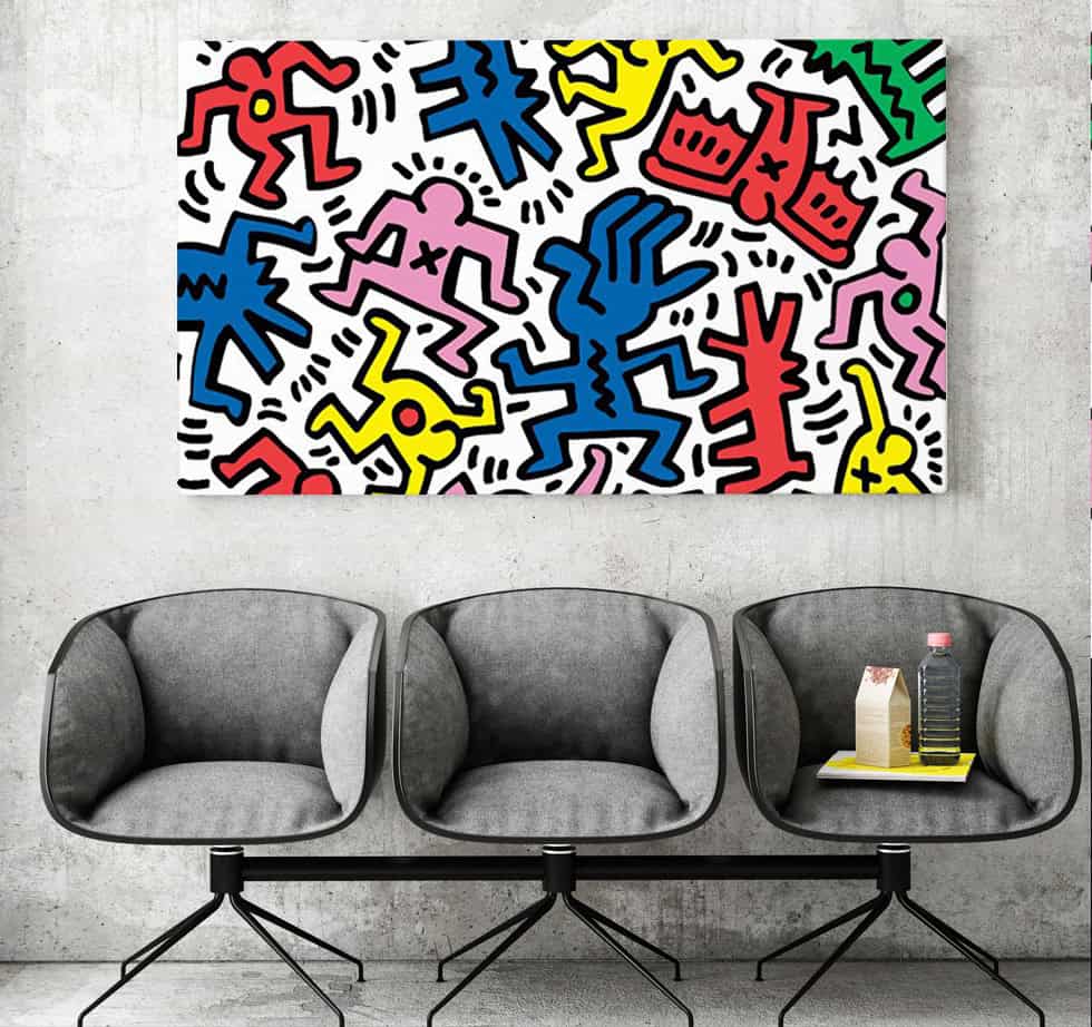
Research shows that viewing vibrant primary tones can boost human brain activity by nearly 30 percent almost instantly. Keith Haring’s iconic visual language uses these specific triggers to redefine modern interiors. Incorporating his artwork into a room creates a vibrant atmosphere that radiates kinetic energy and movement. This is especially true when showcasing bold colorful wall art.
Poppins Shop has spent a decade mastering museum-quality reproductions of Haring prints that honor this legendary style. We apply professional color theory to ensure every piece reflects your inner personality. Our unique designs turn simple rooms into active centers of social interaction and creativity.
Selecting high-quality wall art requires a professional understanding of psychological impacts. This guide helps you identify pieces that boost productivity and focus within any environment. Witness how Haring’s deliberate use of red and yellow tones can effectively transform your daily environment.
Key Takeaways
- Primary colors like red and yellow significantly boost mood and daily energy levels.
- Keith Haring’s visual language bridges the gap between museum masterpieces and home decor.
- High-quality reproductions preserve the psychological intent and technical execution of the original work.
- Strategic placement of vibrant prints enhances social interaction and mental focus in shared areas.
- Professional color theory principles help you select the right pieces for residential or commercial use.
- Using energetic imagery creates a unique environment that reflects your individual character.
Understanding the Keith Haring Color Palette: A Foundation in Color Psychology
Haring’s selection of primary hues provides a fascinating case study in how visual stimuli affect the human nervous system. Modern colorful art prints utilize color as an emotional tool rather than a way to mirror reality.
This approach draws from the science of pure color relationships to trigger specific mental responses in the viewer. By focusing on primary tones, the artist bypasses complex detail to speak directly to our instincts.
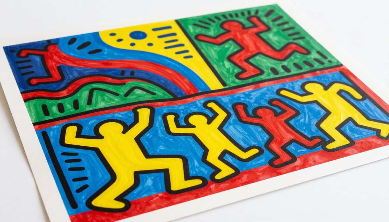
Red: The Energizer of Keith Haring’s Visual Language
Red serves as the core pulse in this visual vocabulary. As a warm, advancing color, it naturally stimulates the sympathetic nervous system to increase alertness.
This leads to physiological changes like a faster heart rate and heightened social engagement. Using red paintings in a creative studio or living area can foster high-energy interactions and provide a bold vibe.
- Activates the sympathetic nervous system for better focus.
- Encourages movement and physical activity in a room.
- Enhances appetite and conversation in social settings.
Yellow: Optimism and Movement in Primary Color Compositions
Yellow acts as the ultimate expression of optimism and movement. This brightest primary shade captures the eye immediately, promoting mental clarity and a positive mood.
In various patterns, yellow wavelengths influence how we perceive cognitive tasks and mental energy. It makes a room feel more expansive and welcoming for collaborative work. Such art helps create a space where ideas can flow freely.
Blue: Creating Balance in Bold, High-Energy Artwork
Blue provides the essential balancing force within a high-energy palette. While the artist uses reds and yellows to excite, blue elements offer necessary visual rest points.
These cooler tones create emotional equilibrium and prevent the viewer from feeling overstimulated. By adding a calming touch, blue ensures the composition remains comfortable for long-term residential display.
How Primary Colors Interact to Transform Room Atmospheres
The interaction between primary colors creates a sense of “visual vibration” that keeps the viewer engaged. Using triads allows for high optical energy without causing mental fatigue over time.
Balancing warm-dominated paintings with cool accents achieves a professional temperature mix. This ensures your home remains both exciting and livable through consistent patterns.
The right color palette can completely shift the mood of a room. To see these high-energy hues in action, discover our vibrant Keith Haring print series and find the color story that fits your lifestyle.
Bold Colorful Wall Art: Premium Keith Haring Reproductions from Poppins Shop
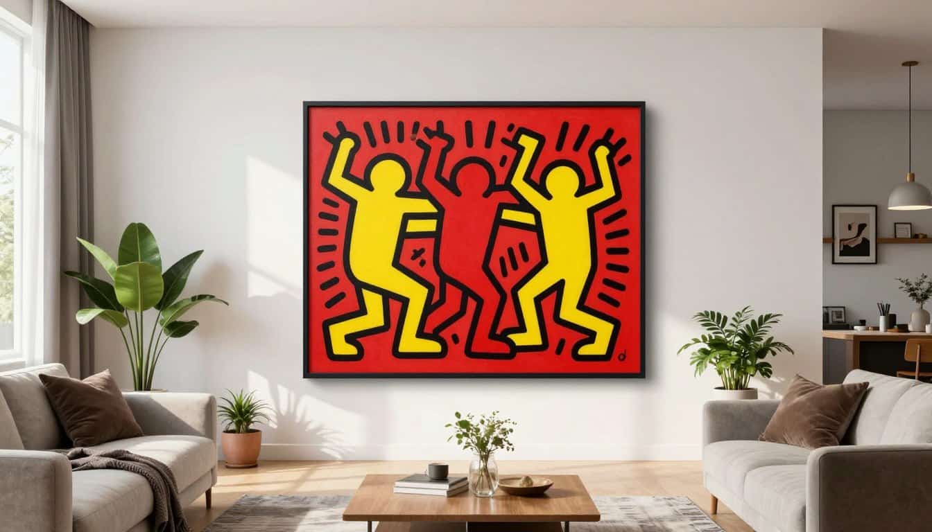
Our collection of bold colorful wall art brings the legendary energy of Keith Haring into your modern living space. We believe that every piece should serve as a long-lasting gift for your home. By combining historical paintings with modern technology, we ensure each reproduction feels authentic and powerful.
Choosing the right artwork means looking beyond the image itself to the materials used. Our studio focuses on technical precision to honor the artist and his iconic style. Every print we produce undergoes a rigorous quality check to meet gallery standards for our customers.
Epson P9530 Professional Printing Technology
We utilize the Epson P9530 professional wide-format printer to create our art prints. This industrial-grade system provides incredible color accuracy and a deep tonal range. It utilizes native pigment inks rather than cheap dye-based alternatives.
These pigment inks offer superior fade resistance and a wider color gamut. This ensures your prints stay vibrant for decades without losing their punch. The high resolution captures every fine line and movement found in the original paintings. This technology allows us to deliver a piece that rivals gallery-quality screen prints in every detail.
Cotton Canvas 380 GSM: Museum-Quality Substrate
For those who prefer a classic look, our 380 GSM cotton canvas is the perfect choice. This heavyweight material provides a museum-quality foundation that is built to last. The natural fiber composition offers a rich texture that adds depth to the artwork.
This substrate is designed to accept heavy ink saturation without any bleeding. It preserves the saturated primary colors that define Haring’s famous style. This canvas provides structural integrity, making it an excellent gift for any serious art lover. It offers a professional presentation that mimics a traditional painting support perfectly.
Matte Paper 230 GSM for Vibrant Color Reproduction
Our 230 GSM matte paper is an excellent alternative for sharp, clean art prints. This paper features a specialized coating technology that maximizes color density. It creates a bold contrast that makes the primary colors pop against the background.
The non-reflective surface is ideal for rooms with various lighting conditions. You won’t have to worry about glare distracting from the print. This high-quality paper ensures a professional finish for every item in our collection.
Hahnemühle Matte Varnish Protection Against UV and Scratches
We protect every canvas with a premium Hahnemühle matte varnish finishing system. This layer acts as a strong shield against harmful UV rays that cause fading. It also creates a physical barrier that resists moisture and environmental dust.
This varnish prevents accidental scratches while maintaining the original matte aesthetic. It is a vital step in ensuring your art prints remain in pristine condition. Your investment stays protected for years to come.
Ten Years of Saigon Atelier Expertise
Poppins Shop relies on ten years of experience from our specialized Saigon atelier. Our team has refined the production process to ensure consistent quality for every gift we ship. We understand how production quality affects the mood of your home. This decade of expertise guarantees that your prints are crafted with professional care and deep technical knowledge.
Applying Color Psychology in Home Decor with Red and Yellow Art Prints
Harnessing the psychological power of Keith Haring’s palette allows homeowners to curate specific emotional atmospheres in every room. This curated collection brings life and energy to any modern space by using the science of color.
Integrating bold hues like red and yellow into your home requires a thoughtful approach to human behavior. These primary shades do not just decorate; they actively influence how you feel and interact with your environment.
Living Room Placement for Maximum Energy and Social Interaction
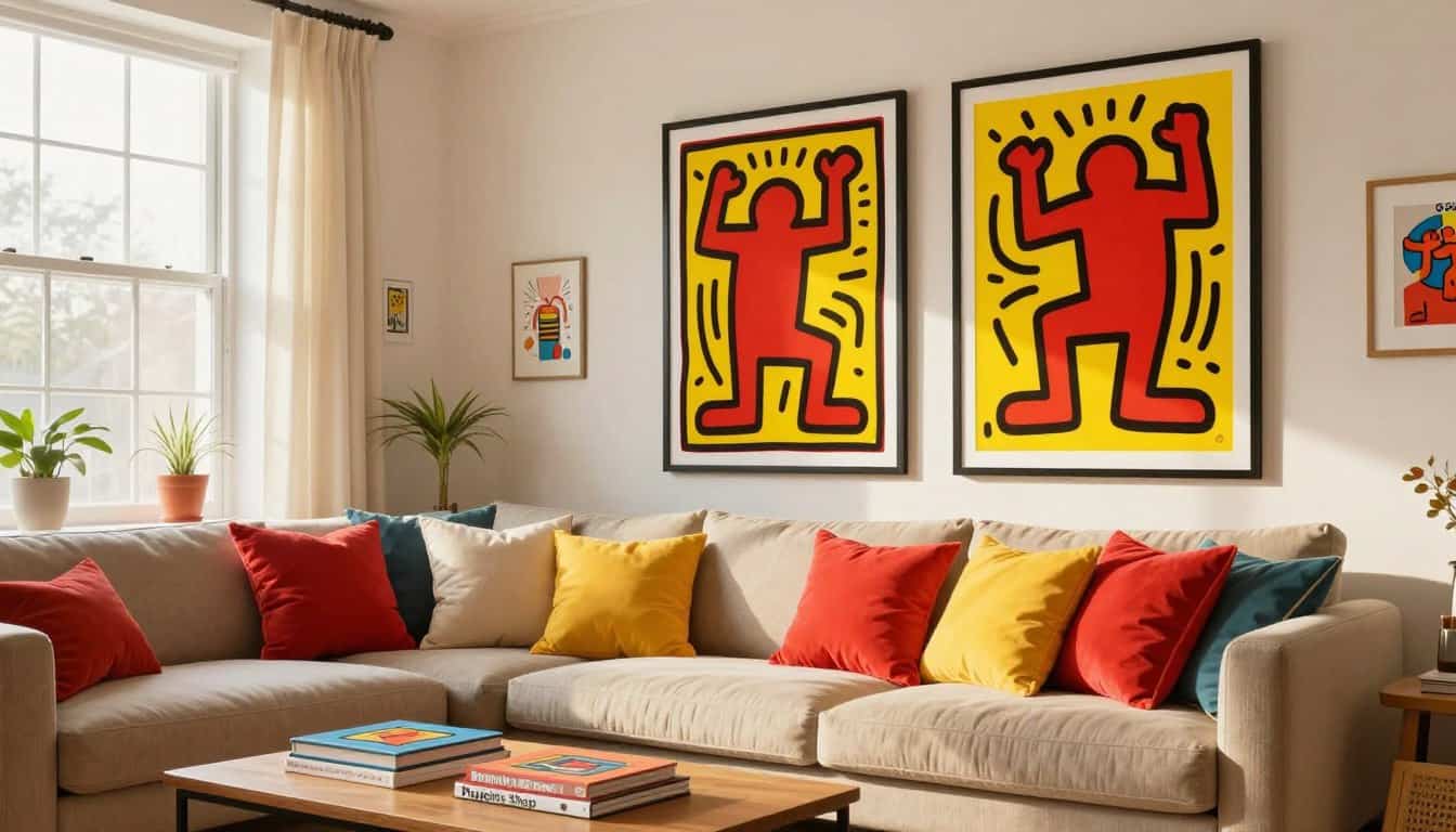
The living room serves as the heart of social connection where family and guests gather. Placing Keith Haring’s red and yellow prints on a central wall creates a dynamic focal point that naturally encourages conversation. These energizing colors foster a welcoming atmosphere that feels both vibrant and inclusive for everyone.
When selecting the perfect spot, consider the viewing angles from your main seating area. High-energy designs work best when they are visible but not overwhelming to the eyes. A well-placed Haring reproduction makes an incredible gift for those looking to transform their living room into a gallery of social engagement.
- Position art opposite natural light sources to enhance color depth.
- Use large-scale prints to establish a sense of modern personality.
- Ensure the artwork sits at eye level for the best psychological impact.
- Combine with neutral furniture to let the primary colors truly shine.
Kitchen and Dining Areas: Where Bold Colors Stimulate Appetite
The kitchen is a functional area where warm hues can have a physical impact on your daily routine. Red and yellow are scientifically proven to stimulate the appetite and increase metabolic activity during meals. Incorporating these colors through art creates a positive association with culinary experiences and high-energy mornings.
Adding a vibrant print to your kitchen or dining area establishes a cheerful vibe that makes food preparation feel more creative. Strategic placement near the dining table can even influence social meal dynamics by keeping the energy high and the mood light.
Creating High-Energy Interiors in Home Offices and Creative Spaces
A productive life often starts with a space that supports sustained mental engagement and quick decision-making. In a home office, Keith Haring’s compositions work perfectly because red stimulates alertness and decisiveness. Meanwhile, the yellow tones promote ideation and help with complex problem-solving throughout the day.
Mounting an energetic piece on a wall within your peripheral vision can prevent mental fatigue. This type of living environment supports professional growth by keeping your mind active and inspired during long work hours.
Bedroom Considerations: Balancing Vibrancy with Restfulness
While adding life to every room is important, the bedroom requires a balance between style and restorative sleep. You can still enjoy the collection by choosing a wall that is not in your direct sightline when resting. This approach allows you to treat yourself to a stylish gift without disrupting your sleep hygiene. It ensures your home remains a sanctuary for both living and recovery.
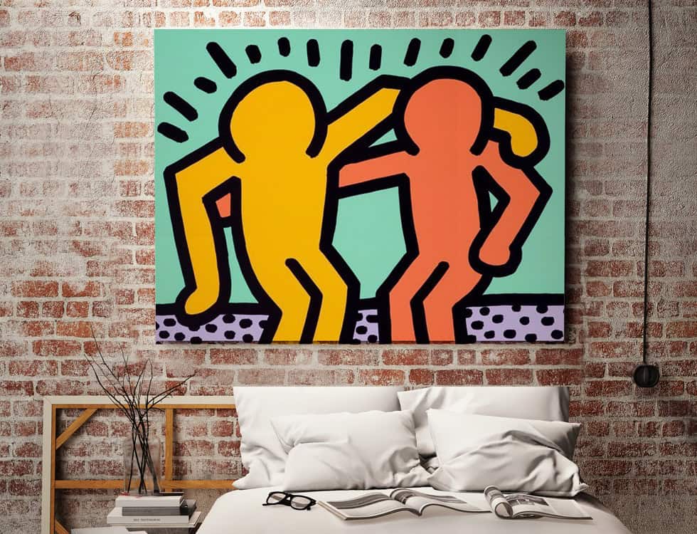
Bold colorful wall art with Keith!
Every vibrant art work you choose serves as a functional tool for environmental psychology. By understanding these mechanisms, you can select red and yellow prints that spark energy and creativity in any room of your home.
Poppins Shop combines technical mastery with a deep appreciation for Keith Haring’s vision. Every piece we produce uses archival materials to ensure your wall art remains a vibrant focal point for years.
Choosing the right wall art involves more than matching a sofa; it reflects your unique personality. A high-quality art selection improves your quality of life by turning a simple wall into an inspiring experience.
Our team provides the expertise needed to help you make informed design decisions. Trust Poppins Shop to deliver art that resonates with your spirit and elevates your art collection for the future.
Art That Breathes Life Into Your Walls
At Poppins Shop, we believe your home should be a reflection of your unique perspective. Whether you’re drawn to the energetic lines of Keith Haring or the deep textures of a hand-painted canvas, our pieces are crafted in our artisan studio using museum-grade materials designed to last a lifetime. Experience the perfect blend of gallery-quality artistry and accessible luxury, delivered with care from our studio to your doorstep.
FAQ
Why did Keith Haring focus on such vibrant primary colors?
What quality can I expect from the prints at Poppins Shop?
Where should I display this colorful collection in my house?
How can I resolve a page blocked extension message on the site?
