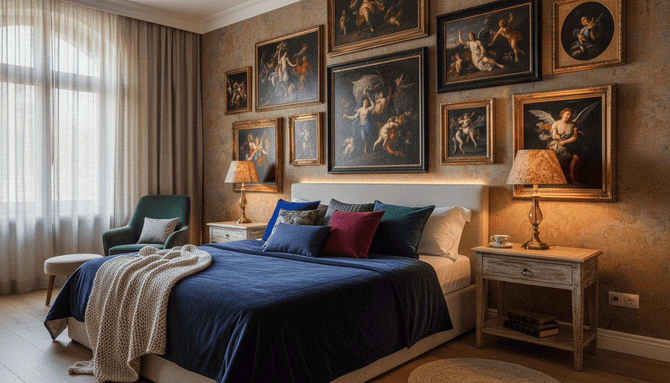
More than 60% of homeowners say a single, powerful artwork changed how they feel in a room. That fact tells us how a well-chosen piece shapes daily life.
We bring Roberto Ferri’s classical technique into a private setting — museum-quality, intimate, and made to last. Our curated selection uses archival canvas and fine prints so each brushstroke keeps its depth for generations.
Quiet intensity. That is the promise. These paintings invite reflection and make your space feel like a personal gallery. Explore the Roberto Ferri Collection at Poppins Shop.
We believe choosing wall art is a personal act. It should elevate your home decor, add sophistication, and reflect craft over mass production. When you invest in a framed print or canvas, you are choosing legacy.
Key Takeaways
- Roberto Ferri’s work brings classical emotion and technique into living spaces.
- Archival canvas and museum-quality prints preserve detail and value.
- One striking piece can redefine mood and create a sanctuary.
- Our curated wall art favors craftsmanship over mass-produced decor.
- Investing in gallery-grade prints enhances both room and home experience.
Defining the Moody Bedroom Sanctuary
A considered collection of figurative prints can turn ordinary walls into a place of quiet intensity. We aim to guide you in shaping a sanctuary that feels personal, tactile, and timeless.
Creating a Mood
Start with texture. Layer velvet textiles, a framed canvas, and vintage posters to build depth. Choose pieces that whisper rather than shout—prints that resonate with your emotional taste.
Roberto Ferri’s work offers that sensual, classical weight. Use a single painting as a focal point. Surround it with smaller prints or landscape pieces to balance the wall and the room.
The Role of Lighting
Light sculpts paint. We recommend dimmable fixtures and warm bulbs to reveal impasto and shadow. Aim for soft, directional light that highlights highlights and preserves mystery.
- Layer ambient and task lighting for flexible moods.
- Choose framed or archival prints to keep texture visible.
- Balance dark tones with warm light to transform the living space.
Quiet drama, careful light, and museum-quality prints. That is the recipe for a private sanctuary that invites reflection and conversation. Understanding Giclée vs. Hand-Painted Ferri Pieces.
Why Roberto Ferri Defines Dark Romantic Art
Ferri translates human yearning into paint—precise, sensual, and quietly authoritative.
He blends Old Master technique with contemporary feeling. The result is figurative work that explores love, loss, and the human condition with rare clarity.
The quiet intensity of his canvases makes them perfect for intimate rooms. Collectors prize his ability to render skin, drapery, and shadow with clinical precision and heart.
What this means for your wall:
- Technical rigor meets sensual presence—each print reads like a small gallery painting.
- Dark, refined palettes create a timeless mood that complements framed canvas and poster selections.
- When you hang a Ferri print in your living room or private space, you bring deep feeling and museum-quality craft into the home.
We offer a careful selection of prints and framed pieces so you can choose works that speak to you. The effect is subtle, powerful, and lasting.
Selecting Moody Bedroom Art for Your Private Space
Begin with measurement: the right scale gives a piece its voice in a space.
Choosing the Right Scale
Scale sets visual weight. A large canvas can anchor the wall and become the room’s focal point.
Smaller framed prints create a curated, layered look. They invite closer inspection and feel intimate.
Measure the wall and note furniture proportions. A common rule: art should take up 60–75% of the available wall above a piece of furniture.
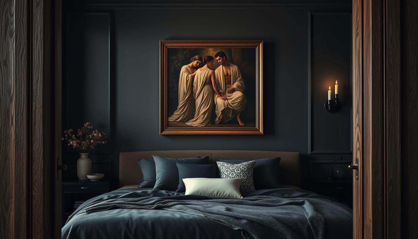
- Try a single large canvas for drama, or a trio of prints for balance.
- Consider how the piece interacts with textiles and lighting in your home.
- Think about scale relative to doorways, headboards, or a gallery wall layout.
A well-chosen artwork anchors the design. It harmonizes proportion, price, and presence so your selection enhances rather than overwhelms the room.
The Sensual Appeal of Figurative Oil Paintings
Figurative oil painting has a rare way of making feeling visible—through pose, light, and texture.
We value how the body becomes language on canvas. The play of shadow and highlight suggests breath, weight, and quiet motion.
The tactile surface matters. Thick pigment and subtle glazing invite closer viewing. That tactile quality turns a print or canvas into an intimate discovery.
Roberto Ferri’s work excels at these small, vulnerable moments. He renders the woman as both resilient and exposed, a presence that transforms a room or living room into a thoughtful space.
- The sensual appeal comes from tender anatomy and controlled light.
- Oil texture adds a depth that a flat poster cannot match.
- Each art print or framed print opens new emotional territory in your home.
Choose pieces that speak quietly. A carefully selected painting or gallery-quality print brings sophistication and comfort—without noise.
Understanding Texture and Depth in Fine Art Prints
Texture gives a print its voice—subtle ridges and printed sheen make a painting feel alive.
Visual texture recreates impasto and brushwork. Advanced printing uses layered inks and micro-relief on canvas to mimic original touch. The result is a print that reads like a small painting from arm’s length.
Visual Texture
The surface matters. We match paper and canvas to the image so highlights and shadow keep their depth. That tactile suggestion opens new ways to experience an artwork in your living room or on a gallery wall.
Archival Longevity
Longevity is non-negotiable. We use archival canvas and pigment inks that resist fading. Proper materials protect the image from UV, humidity, and time.
- High-quality canvas preserves texture and color for decades.
- Archival inks prevent yellowing and maintain price-worthy tone.
- Careful mounting and framing protect the print in any room or space.
Understanding these details helps you choose a print that honors the original painting. Invest in museum-quality products. Preserve the soul of the work. Enjoy the piece for generations.
Prioritizing Safety with Non-Toxic Archival Canvas
Choosing the right canvas is a commitment to both beauty and wellbeing. We make that choice for you.
Poppins Shop has a ten-year track record of delivering museum-quality, non-toxic materials. Our prints and art prints are produced without volatile organic compounds. That keeps your living room and room air safer.
We pair archival canvas with pigment inks that resist fading and meet museum standards. The result opens new possibilities for long-term display without worrying about price or premature wear.
Beauty should not cost your health. Our selection of wall art, prints, and poster-style pieces prioritizes safety and durability. You get vintage feeling and landscape depth with modern, safe production.
- We use only non-toxic, archival canvas for every art print and print product.
- Ten years of trusted practice—museum-quality materials that last.
- Our production avoids harmful chemicals so your home remains a peaceful sanctuary.
- Enjoy gallery-grade artwork and prints with confidence in safety and price.
Trust in craftsmanship. Trust in care. We craft each canvas so your page of life—your wall—opens new calm in the living space.
Exploring the Emotional Weight of Amor Et Mortem
Amor Et Mortem confronts us with the fragile border between desire and loss. The composition presses figures into close, formal tension. Dark fields of color frame the scene and deepen feeling.
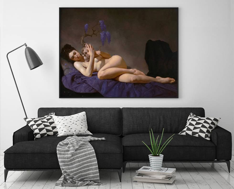
The painting’s weight comes from contrast—tight composition, saturated shadows, and restrained highlights. Those choices invite quiet inquiry. The viewer slows. Reflection follows.
The figures reveal Ferri’s classical command. Minute details in drapery and skin read like lessons from an atelier. That mastery translates well to high-quality canvas and art print reproductions.
Bring this artwork into your home and the wall becomes a page of private reckoning. We offer museum-standard prints that hold every shadow and tonal shift. Each print preserves nuance without raising price beyond fair value.
- Explores love and mortality with dramatic composition.
- Rendered for preservation as an archival print or canvas.
- Transforms a room into a place that opens new emotional depth.
Choose a piece that challenges and comforts. This selection opens new ways to live with profound, honest work.
Bringing Drama to Walls with Angelo Caduto
Angelo Caduto arrives as a visual event—movement frozen, tension preserved, feeling magnified.
Roberto Ferri’s Fallen Angel commands attention on any wall. The dynamic pose and rich, dark tones create motion that reads even from across the room.
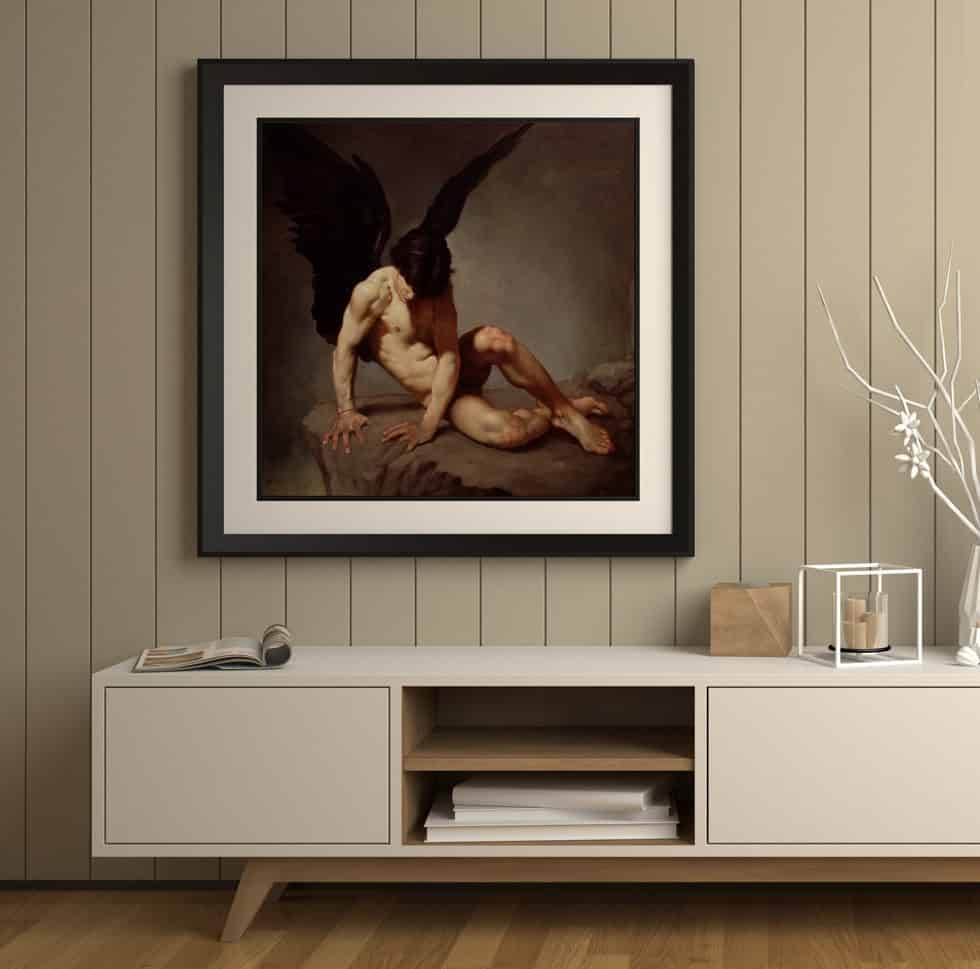
We craft each art print and canvas so the original’s intensity survives translation. Shadows remain deep. Highlights keep their warmth. The face holds that signature blend of classical beauty and modern angst.
Bring drama without fuss. A high-quality print of Angelo Caduto turns plain wall art into a focal point. It elevates your home and sparks conversation.
- Effortless drama with a museum-grade art print or canvas print.
- Rich dark tones reproduced with precision in our products.
- Powerful imagery that celebrates struggle, transformation, and beauty.
- Careful selection balances presence with price and long-term value.
Choose this artwork and the room changes. The piece becomes a statement—sophisticated, visceral, and unmistakably yours.
The Quiet Intensity of Amore Piange Sulla Tomba Di Psiche
In Amore Piange Sulla Tomba Di Psiche, grief slows to a readable pace. The scene makes sorrow intimate and visible.
Love is rendered with delicate brushwork. His pose and the muted palette create a hush that invites reflection.
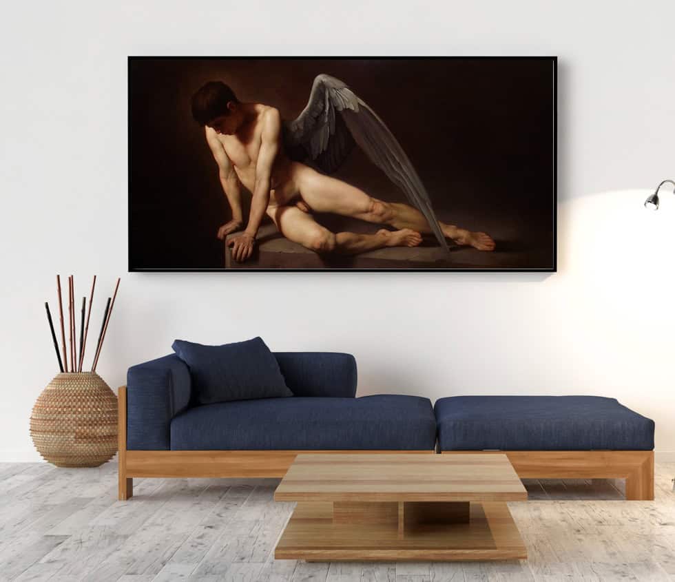
We offer museum-quality art print reproductions that honor that delicacy. Each print and canvas preserves subtle glazing and tonal depth.
Why collectors choose this work:
- The painting conveys complex narrative through spare gesture and shadow.
- As wall art, it provides calm—turning a wall into a place for quiet thought.
- Artistic inspiration drawn from icons like Caravaggio and Roberto Ferri. That’s Why Premium Italian Cotton Matters for Dark Art.
Bring this print into your home and the room gains a gentle, vintage feeling. The poster-like presence reads as both timeless and deeply human. It remains a treasured piece in any collection.
Incorporating Mythological Themes like Chloris
A modern take on an ancient story gives a wall real narrative presence.
Chloris draws on classical mythology to explore transformation and natural beauty. The figure and surrounding flora feel living—tender, fragile, insistently present.
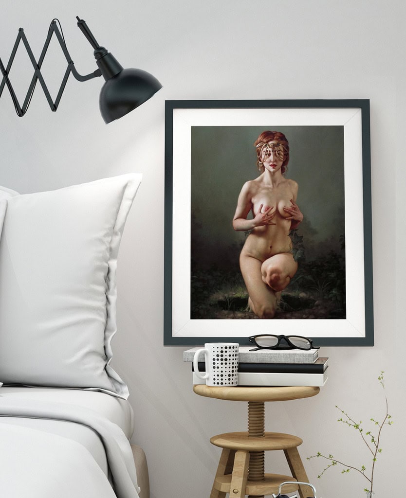
The painting’s soft, ethereal lighting translates beautifully to a high-quality art print or canvas. We reproduce subtle glazing and the floral detail so the print holds the original’s mood and narrative depth.
Mythological themes give your home a timeless thread. A single piece like Chloris adds story and vintage resonance without overwhelming a wall or a room.
- Choose a museum-grade print to preserve detail and tone.
- Pick scale and placement to let the figure breathe on the wall.
- Consider a framed poster or canvas for longevity and flexible price points.
By choosing Chloris, you select an art print that links ancient narrative to contemporary feeling. It is a thoughtful addition to any selection in your home.
Making a Statement with The Knights of the Apocalypse
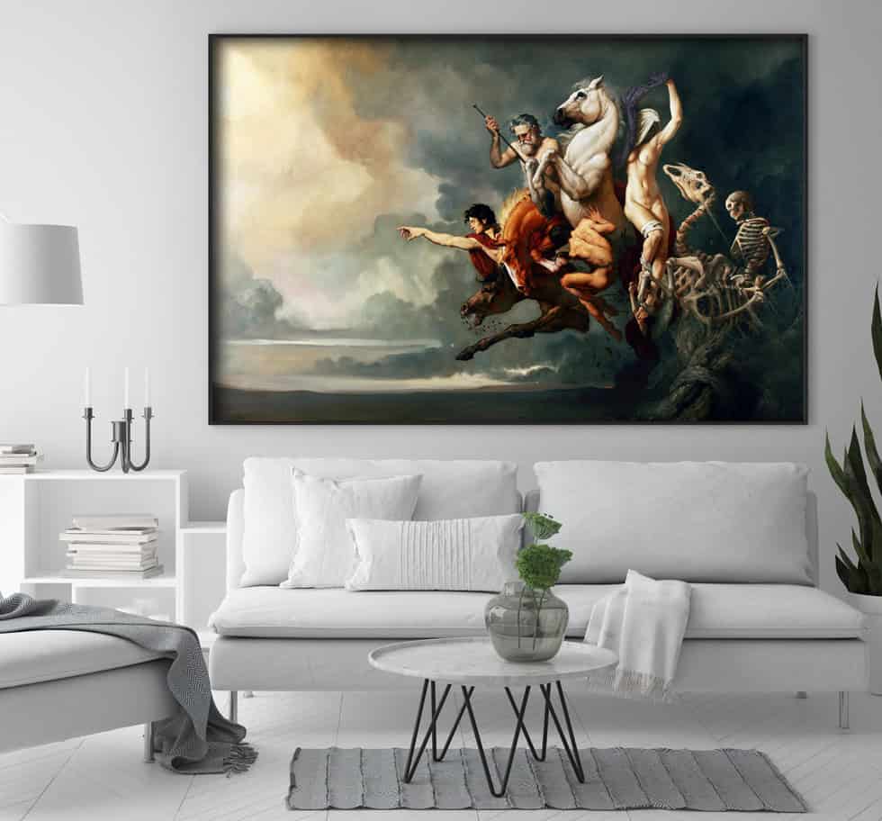
A single epic canvas can shift a room’s energy; The Knights of the Apocalypse does exactly that. I Cavalieri Dell’apocalisse is one of Roberto Ferri’s most ambitious, dramatic works.
The painting brings themes of power, destruction, and an end-of-times vision into sharp focus. It anchors a wall with dark, figurative force. The scale demands attention and rewards close looking.
Collectors choose this work when they want a bold statement in the home. We pair it with Deliver Us From Evil to build a cohesive, intense selection that reads like a miniature exhibition.
- Large canvas presence for a definitive focal point.
- High-fidelity art print and poster options that preserve detail.
- Crafted prints that keep tonal depth without inflating price.
Choose these pieces to curate a collection that is both bold and thoughtful. The result: a wall that speaks with weight, history, and unmistakable craft.
Finding Interior Design Harmony with Dark Aesthetics
When walls grow darker, every canvas gains presence; the trick is to let pieces breathe.
Deep tones create a sophisticated backdrop. They make color and texture sing. But without careful light, a room can feel closed in.
Balancing Dark Tones
Light matters. Use soft, warm fixtures to highlight an art print or print without flattening shadow. Layer ambient and directional sources for depth.
Natural elements—plants, woven textiles, wood—soften intensity. They bring warmth and scale against a dark wall.
- Balance the visual weight of a canvas with lighter furniture or a textured rug.
- Place an art print where light can reveal glazing and pigment.
- Choose wall art and prints that complement mood without competing for attention.
- Let a single selection act as the focal point—less is often more.
We aim for spaces that feel dramatic and comforting. With careful light, material, and scale, your room becomes a quiet, powerful refuge.
Tips for Arranging Art in Intimate Spaces
Arrange with intention—placement shapes feeling as much as the image itself.
We hang pieces where the eye naturally rests. Aim for centerline at eye level. That keeps a canvas readable and calm.
Consider furniture relationships. A print above a chest or sofa needs breathing room. Leave negative space so each piece can speak.
Group smaller works to tell a story. A careful cluster reads as one thoughtful selection rather than scattered clutter.
- Placement: Hang the focal piece where sightlines meet—near seating or at entry.
- Scale: Match canvas size to furniture; avoid pieces that feel too small or too loud.
- Spacing: Give prints room; 4–6 inches between frames keeps the wall composed.
- Personal touch: Let your selection reflect what moves you—mood matters more than trend.
We guide you to a curated result: calm, balanced, and intimate. The right arrangement makes the wall feel intentional—quiet, worthy, and wholly yours.
Maintaining a Peaceful Atmosphere with Professional Framing
Professional framing turns a print into a defended, lasting presence on your wall. It is the final act of care—simple, decisive.
High-quality frames protect. They keep dust, light, and humidity from dulling pigment. They also steady fragile edges on a canvas and guard mounts from warping.
The right frame complements dark, romantic imagery without stealing focus. Choose finishes that echo the palette—deep wood, burnished metal, or a narrow black slip. These options enhance presence and maintain calm. The Logistics of International Art: Rolled vs. Framed.
- Professional framing preserves an art print and extends its life on the wall.
- A thoughtful surround elevates a simple print to museum temperament.
- Consult a professional framer to match mats, glazing, and backing for your canvas prints.
We believe framing is the last, loving touch. Invest there and your selection becomes a lasting home treasure—quiet, protected, and wholly yours.
Why Poppins Shop Leads in Museum Quality Standards
Our studio standards were built on a simple promise: faithful reproduction, safe materials, lasting presence. We have a ten-year track record delivering museum-quality art prints to collectors across the United States and beyond.
We choose materials with care. Every canvas is printed with archival pigments on non-toxic substrates. Advanced color profiling and layered ink methods preserve impasto, glaze, and tonal depth.
We protect the artist’s intention. Our process keeps contrast, texture, and shadow true to the original. The result is a print that reads like a small painting on your wall.
- Poppins Shop leads the industry with a decade of museum-quality production.
- We use only top-tier materials so every canvas print endures.
- Choosing us supports a legacy of craftsmanship and tangible care for artists and collectors.
Trust in provenance. Trust in technique. Choose prints that honor the original and enrich your wall for years to come.
Moody bedroom art final say
Let the final selection be an act of care—choose works that steady the room and the spirit.
We believe quality and safety matter as much as feeling. Choose archival prints, non-toxic canvas, and frames that protect the image. These choices keep a piece vivid and trusted over time.
Good placement and framing turn a reproduction into a daily refuge. A single, well-made piece can bring peace, sophistication, and renewed presence to your home decor.
We hope this guide inspires you to live with work that moves you. Thank you for trusting Poppins Shop to help curate a collection that holds feeling, craft, and lasting value.
FAQ
What makes Roberto Ferri’s sensual oil paintings suited for a moody bedroom sanctuary?
How do we create the right mood around dark romantic pieces?
What role does lighting play in displaying figurative oil paintings?
How should we choose the right scale for a private space?
Why choose figurative oil paintings over prints for a sensual effect?
How do texture and visual depth affect the viewing experience?
Are archival prints and canvases safe for indoor use?
How long do archival prints last without noticeable fading?
What care does framed artwork require to maintain a peaceful atmosphere?
How can mythological themes like Chloris or Amor et Mortem fit modern interiors?
How do we balance dark tones with living areas to avoid a heavy feel?
What should we consider when arranging art in intimate spaces?
Why choose professional framing over ready-made options?
What does “museum quality” mean for Poppins Shop reproductions?
Can these dramatic, vintage-style pieces work in a living room or gallery wall?
Do you offer advice on selecting frames and finishes?
Are framed prints easy to hang and secure?
How do floral or country motifs fit with darker, romantic works?
